PRODUCT
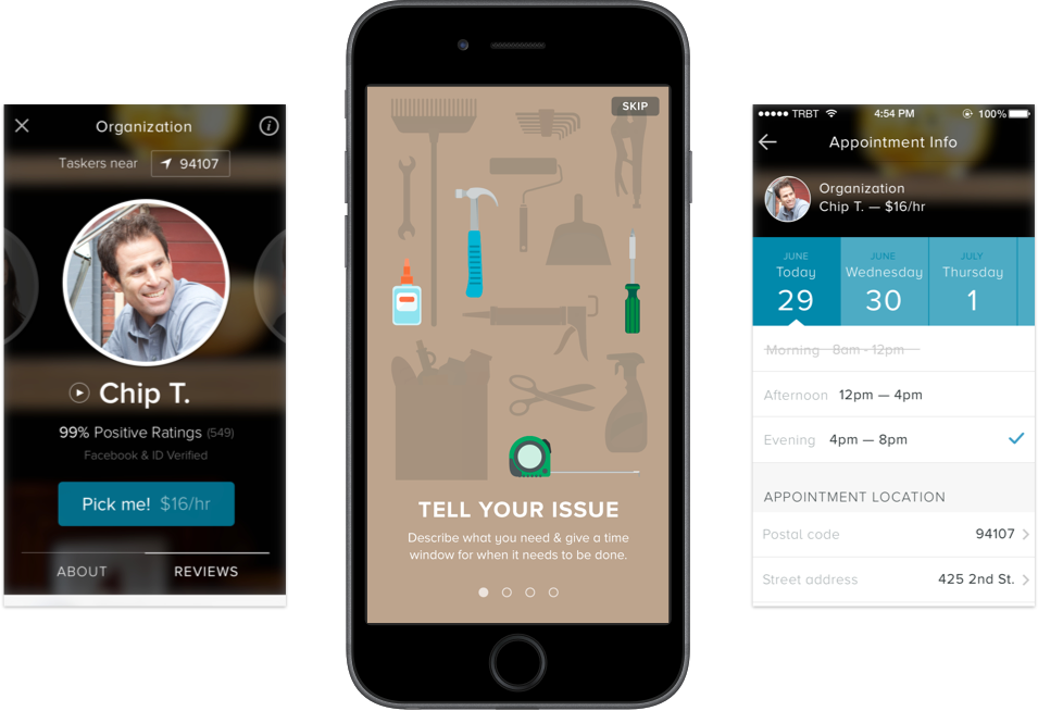
Breaking down the user hesitation & comfort was the main focus. Understanding what features to carry over from the old system was as important as the new ones.
Rating & reviews was a trusted source that we carried over beacuse it was a great place for older Taskers to stand on. Then highlighting personal bios and larger profile pictures to make users to feel comfortable.
USER EXPERIENCE
One huge difference from the old TaskRabbit system was the core userflow. The some points focus were to decrease the wait-time for users to get the right Tasker, ensure proper wages on the platform and minimize delay in conversation between Tasker & client.
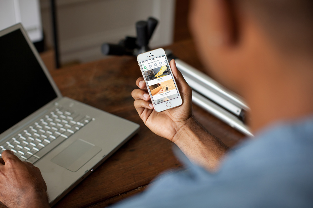
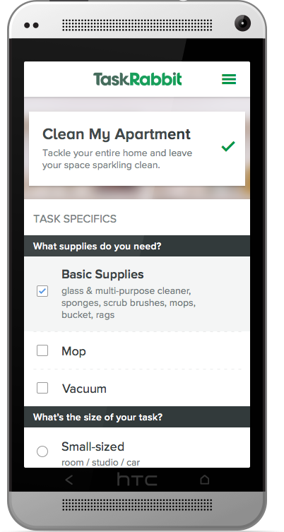
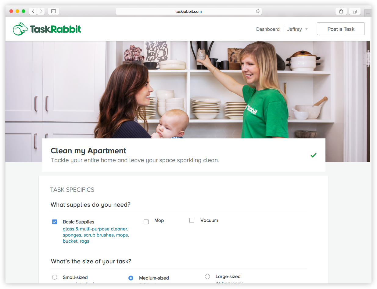
With the new experience we also launched the product on mobile web & a native Android experience.

Brand & Marketing
Later my time at TaskRabbit was to bring the visual story of the brand and product closer together. In the terms of branding there was a great story to stand on but only a two page visual guideline.
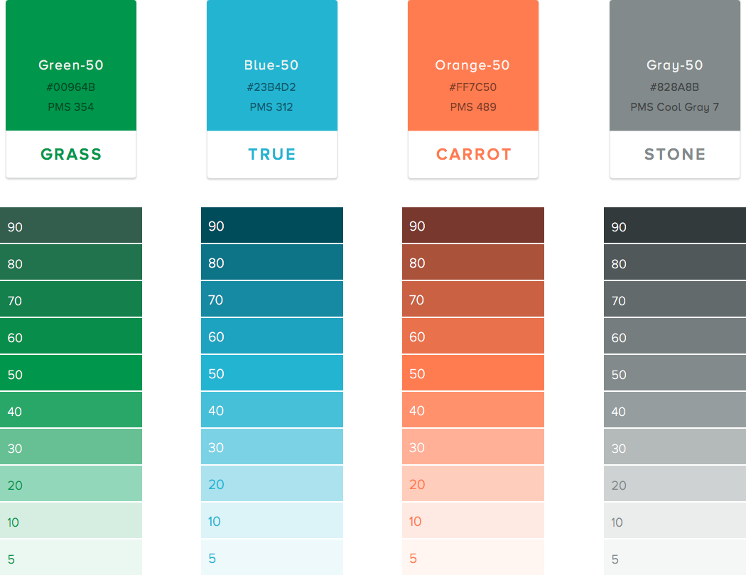
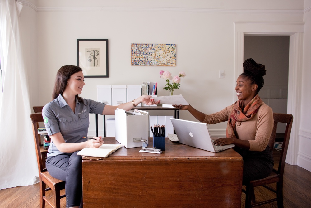
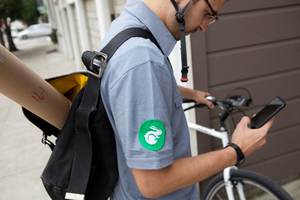
Starting with updating the typography & color scheme which were core to the whole eco-system. Then the focus was in on photography direction for in product & marketing. At last it was to update the mark, to make it visually softer & easier to design with.


